It has launched! The mobile version of AgentPalmer.com is now live and ready for your smartphone, so you can geek on the go! (You may already know this if you’re viewing this on your phone.)
Of course, it is paired down a bit as far as the wonderful design, that Ryan Lynn created for the desktop version. But all the goodness of the geeky content is more easily accessible from your phone. It’s more geek than your pocket can handle, or maybe just enough.
The straight forward mobile first directive that I worked with Chris from Nohawk.net on building has all the wonderful content that I’ve created ready for you at a moment’s notice.
And if you’re looking for me on social networks, links to them are all beautifully displayed on the menu, as a brilliant touch of mobile design, that I have to take my hat off to Chris for.
Beautiful Social Network Icons
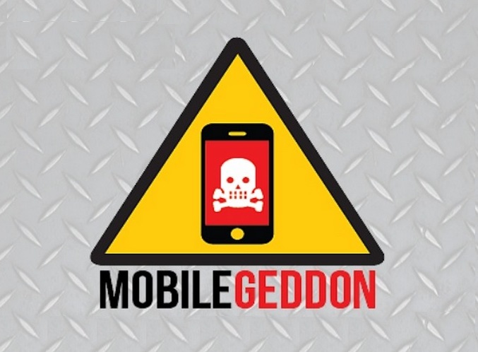
Why did I launch a mobile site? Two reasons. One, I wanted to give mobile users a better mobile experience, because if that’s how they consume my content, it should be formatted to make it as easy as possible to digest the words I am putting together. And two, in the event that Google’s Mobilegeddon ever happens, I want to be prepared, so that mobile users would still be able to find my content.
In creating such an experience the design takes a backseat, meaning that mobile users, don’t get to see my desktop “messy desk” theme, or the cup rings, fortune cookies, typewriter, coffee cup, paper clips, glass of scotch, or d20. But maybe I’ll be able to squeeze them in on a future update.
Because, those are all wonderful design elements put together by Ryan Lynn for the desktop version of this site, that add a little more atmosphere to the content I create and paint a picture of who I am.
 But with the mobile site, such things get pushed aside. And with good reason. If I wanted to incorporate all of that stuff, then the user experience in mobile, would be less than stellar, and the content would either scroll on forever, which is does anyway because I’m not big on brevity, or it would be impossible to read.
For the almost 24% of users that are my mobile audience, this site is the site you’re looking for. And it is a vast improvement on how you’ve been viewing it up to now.
I mentioned a possible version 2.0 with the added elements of my desktop design, and that could happen, depending on the future technologies not existing right now. And I think they would make a wonderful addition to the mobile site, but first and foremost, I wanted to give mobile users a better experience and with that in mind, it’s a successful launch.
So to any of my mobile users and specifically my twitter followers, you mobile bunch you, I hope you continue to enjoy my geeky content in an much easier to read format. No more zooming in to read the large format desktop site on your small, or in some cases, medium sized screens. This one’s for you to geek out, while you’re out for all your geeking on the go needs.