Minimalism is a movement, especially when it comes to pop culture fan art, be it movie posters, superhero logos, or television show promos. The ability to translate the core concept of a book, movie, show, or idea with the least amount of strokes is captivating.
Some Iconographic concepts are easier to translate into this form than others because, by nature of what they are, some pop culture properties hand the artist a multitude of things to focus on, all of which easily identify the original material. Because of the depth of this well of art, I’ve boldly pronounced this “Volume 1” in the hopes that I’ll be revisiting this on occasion. So let’s start with the first five.
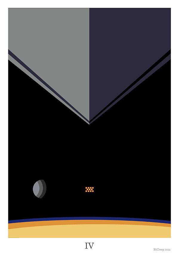
Star Wars A New Hope Minimalist Poster by 3ftDeep
Starting off with “Star Wars – A New Hope – Minimalist Movie Poster” which could also be called “Rogue One An Ending Minimalist Poster, is artist 3ftDeep.
“Classic movie iconography in simple terms (simple is as simple does)” is the caption and it fits. The beginning of the movie is a Star Destroyer, and we see that following the rebel ship with the “IV” at the bottom. The choice here is great because it is the start of the film and the color palette is phenomenal.
Now, it is no joke that this same iconography from a different angle could also be the end of Rogue One, because although the perspective isn’t the same in Rogue One, the elements in the piece and on the screen would be the same.
If you enjoy Star Wars and minimalism, you can spend hours looking at images on the internet, which isn’t productive at all, but it can be inspiring.
Moving from science fiction to… science fiction, up next is Jurassic Park.
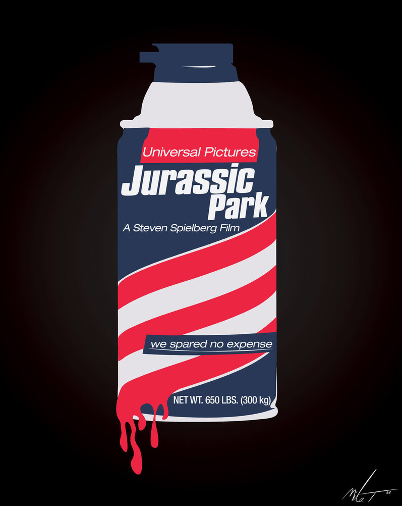
Jurassic Park by ZZTrujillo
This “minimalist movie poster for Jurassic Park” is priceless. There isn’t even a dinosaur in the piece, nor even is there any nod to them other than the title and the weight.
Artist ZZTrujillo used the iconic Barbasol shaving cream can and rebranded it, leaving the red, white, and blue colors to remain.
The quote, used often by John Hammond throughout the film “we spared no expense” is a great addition, as is the detail of the color running off of the can like blood.
The weight “net wt. 650 lbs. (300 kg)” is a nod to something heavy, though what is a mystery to me. It’s too large for a raptor and too small for a T-Rex, so it’s anyone’s guess, but I like idea. The thing is, the can of embryos gets lost in the mud to most people when they recollect the film, except for maybe the scene where Nedry uses the shaving cream as whipped cream with Dodgson.
But here it is, a rebranded can of barbasol and no dinosaurs, and as a fan of the film and the book, I really think it’s fantastic.
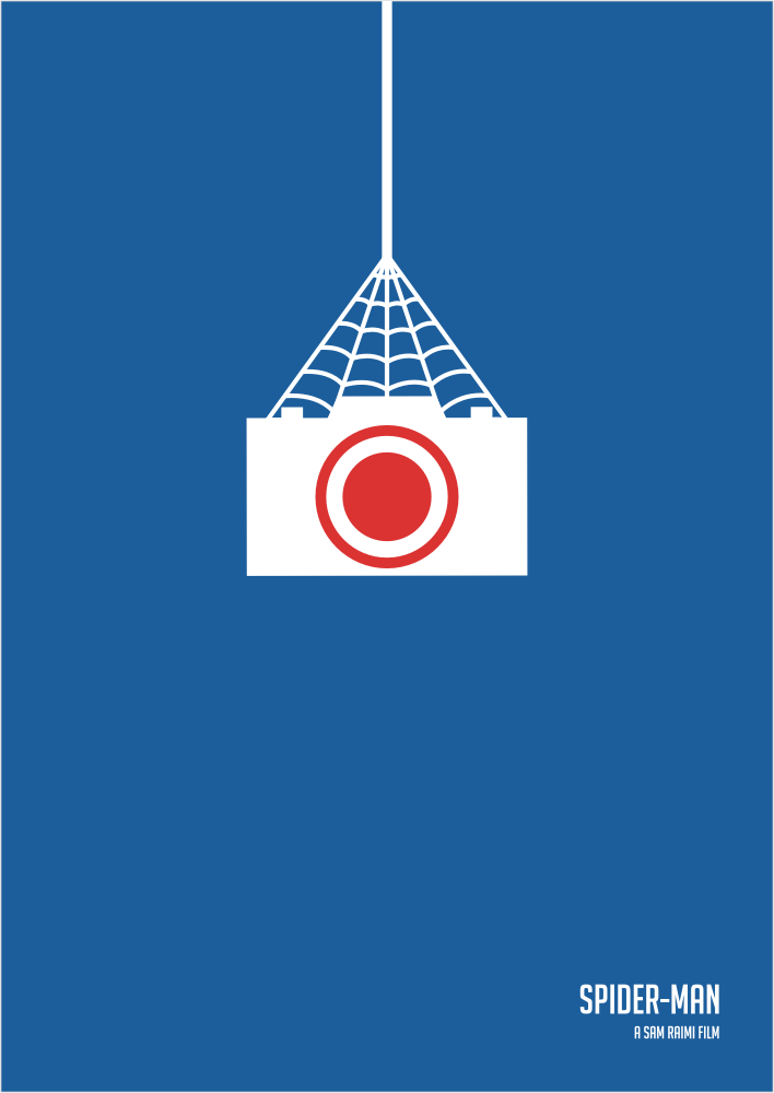
Spider-man – Minimalist by William-Oliveira
From dinosaurs to spiders, or Spider-Man specifically the first movie in the trilogy done by Sam Raimi.
This is minimalism at work. William-Oliverira created this movie poster, captioned, of course, “with great power comes great responsibility” and I think he could have replaced the title and “A Sam Raimi Film” with that quote to similar effect.
This is a beloved superhero, and the camera, the web holding it up, and the color scheme provide you with all the knowledge and iconography you need to determine what you are looking at well before your eyes travel to the bottom of the piece.
I specifically enjoy the use of white on blue, which is a common theme among minimalists. Starting with a colored canvas instead of a white one. Remember, kids a “blank canvas” doesn’t mean a white canvas.
And where do you go from Spider-Man? You jump down into the sewers yelling “Cowabunga” and join up with the Teenage Mutant Ninja Turtles.
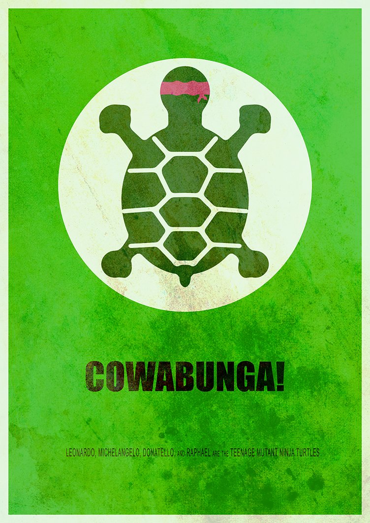
TMNT Cowabunga – ItomiBhaa
Aside from the text at the bottom, “ Leonardo, Michelangelo, Donatello, and Raphael are the Teenage Mutant Ninja Turtles,” there are three elements on this poster by ItomiBhaa.
The first is a baby turtle, who I’m going to guess is Raphael, given that he’s the one most likely to go off on his own, as he’s done in many times, and because the head wrap is red, it’s a dead giveaway to fans.
The second is the circle, which the turtle is in, and this I’m going to speculate could represent either the ooze, that made them grow, a spotlight (or limelight, if you will) that they’re always trying to avoid, or even the round sewer holes that give them access to the whole city.
Either way, minimalism is supposed to do that. The fact that what some people would see as just a circle, and isn’t the case with fans, is an example that minimalism is often more than what you’re seeing.
The last element “COWABUNGA!” is an equal representation of the turtles as their names or even TMNT. The movies, the television shows, the comics, Cowabunga is there in every variation.
And lastly, we look into something designed with more color than the rest.
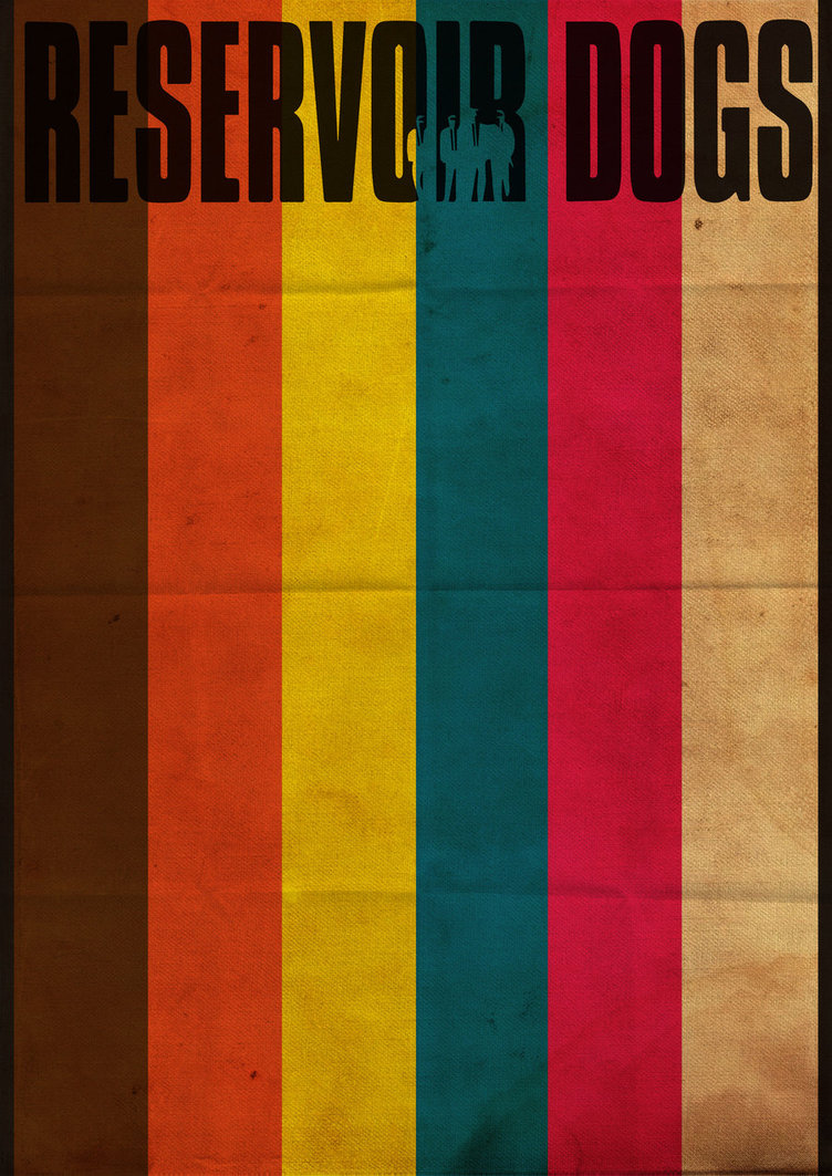
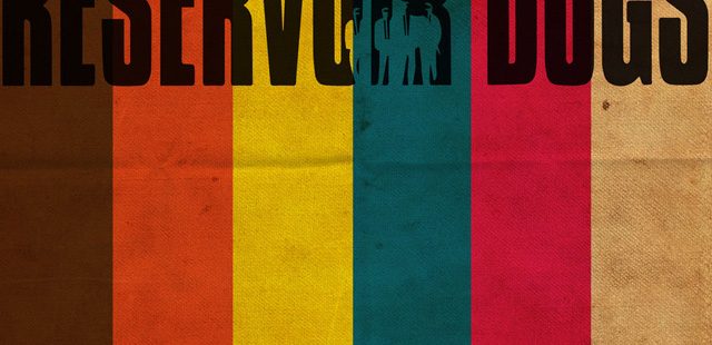
Reservoir Dogs Minimalist Poster by Grey-Woolf-Designs
Designer Grey-Woolf-Designs captioned this “A minimalist poster for the Tarantino classic ‘Reservoir Dogs.’”
The film follows Mr. Brown, Mr. Orange, Mr. Blonde, Mr. Blue, Mr. Pink, and Mr. White, who all wear black suits throughout.
So, at the top we have the title, with a cut out silhouette of the “Dogs” and the rest is simply the colors of their names.
The idea and follow through are great, but it’s the paper texture and the detail that makes this look like an unfolded piece of poster that really sells it. Can anyone who’s seen the movie really sell the designer or myself on the idea that this should be done on a pristine perfect piece of paper? I doubt it.
So there you have it. Five minimalist pop culture posters for this edition of Small Oddities.