A Special Report by Agent Parker
Well, it’s been a week, and I’ve finally gotten through all of “Marvel’s The Defenders.” I’ll wait while you finish silently judging me. Done now? Then let’s continue. In the week since then, something has continually bothered me.
It’s not that the Netflix exclusive that finally brought together Daredevil, Jessica Jones, Luke Cage, and Iron Fist was difficult to watch. (You can save your Internet hivemind hatred of Finn Jones for another day). It’s not even that it was difficult to find the time to watch it. There’s enough laundry in our house to keep a small army of domesticated husbands busy folding clothes while watching “their stories.”
It’s the fact that everything that I enjoyed aesthetically about the individual series that led to “Defenders” also turned out to be the thing that I hated most about the ensemble show.
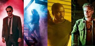
Let’s recall, if you will, the commanding yellows of the Harlem that served as the backdrop of “Luke Cage,” the unsettling blues and purples of “Jessica Jones,” the red-tinted hints of danger of “Daredevil,” and the sickly hospital-like greens of “Iron Fist.”
They built a cohesive sense of space for the singular characters. The colors let you know when the heroes are in control, in a fight for their life, or when their alter egos were hidden beneath the surface.
From the very first moments of “The Defenders,” we’re awash in those sickly greens in the underground of Cambodia. We’re rushed to Jessica Jones’s drunken stupor where even Trish is clothed in a blue blazer outside the bar; Seagate Prison, where everything from the cinderblock walls to Foggy Nelson are covered in yellow light; and coffee makers that are accented in red flash inside Matt Murdock’s swanky apartment before his bright red folders rest on a courtroom table otherwise bathed in hues more recognizable to us mere mortals.
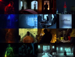
The Defenders Color Schemes
This bullshit continues in the same fashion for six out of the eight episodes, with brief moments for our eyes to rest in between.
SPOILERS AHEAD (except for, like, two of those bad guys from The Hand. There’s not a head between them.)
Take Episode 4, “Royal Dragon,” for example. It’s the first real moment where the team comes together outside of the wonderful fight scene at Midland Circle in episode 3 accented by Run The Jewels. Danny Rand flashes some cash securing a temporary hideout in the restaurant presumably of the same name. From that point on, Danny’s cash-colored influence is seen on everyone and everything.
EXCEPT FOR FUCKING MATT MURDOCK, who decides to stand as close as humanly possible to the red neon light in the front restaurant window as if to say to the rest of the team, “LOOK AT ME! I’M FUCKING DAREDEVIL!” Aren’t you supposed to be hiding out, Matt? Weren’t you, just minutes ago, complaining about the fact that you could still hear neon? “Who hears neon?” It’s no wonder you’re discovered by everyone in the room minutes later.
Later, after Jessica’s hissy fit and exit from the restaurant, she and Luke are covered in blue neon lights that wouldn’t exist behind any restaurant. Ever.
I get it! They were different people whose well-known comic book costumes had different colors! Even if you’re the most casual fan of these heroes or just their presence in the Marvel Cinematic Universe, if you’ve reached “The Defenders,” you’ve already seen all of this.
This hand-holding and color-coded coddling, more than anything else, made me feel stupid. It also made me believe that they would never come together as a team because the creatives behind “Defenders” couldn’t do anything more creative than throw lighting gels recklessly across their sets.
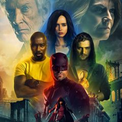
Marvel’s The Defenders
The color palettes of the singular series brought us into the character’s worlds, and in some ways made us know and care more about them. Keeping them for so long in such overt ways throughout “Defenders” alienated me from enjoying the team dynamic. If this was to be an ensemble cast, it should have been treated as such.
If you understand the colors of light, you know that combining all of the colors gives you white light. But that clear color palette, the overall tone that should have been present after episode 3 through the end of the season when the team is separated again, is so blisteringly absent outside of anything tied directly to the chaos at Midland Circle that it almost hurts to watch.
Rather than a richly woven tapestry, “The Defenders” comes out looking like a child’s muddied finger painting exercise. For a cinematic universe that rewards its viewers loyalty with Easter eggs and cameos of every kind, this series almost goes out of its way to insult its viewers’ intelligence.
Color me upset.
Agent Parker is a Northeastern Pennsylvania-based artist, writer, father and geek. Follow his nonsense on twitter @PeterParker_Pa and see his pop culture goodies at PeterParkerPA.com.